Before creating a table ...You need a database before being able to create an use a pivot table. It's possible to create and manage simple databases from Excel. There are certain terms that you should know before starting.
| Field | Characteristic of a person, a thing or an event that you want to keep in a database. Each column represents a field. |
| Record | Series of fields that describe a person, a thing or an event. Each row represents a record. |
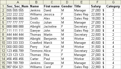
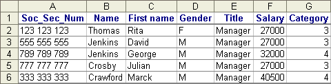
In an Excel database, every column represents a field. The name of the field should be on the first row. Every following row represents a record. So that Excel is capable of recognizing all the records that compose the database. It's important not to leave any empty rows. All the rows after the name of the fields must have records. The following database has some data on the employees of a company.
You can write the data below in a worksheet copy an dopen the datalist.xls document thant you can also find in the demonstration files Web page.
Create a pivot table Place the cursor on any cell between A1 and G16; where the database is located. Place the cursor on any cell between A1 and G16; where the database is located.
From the Data menu, select the PivotTable and PivotChart report option.
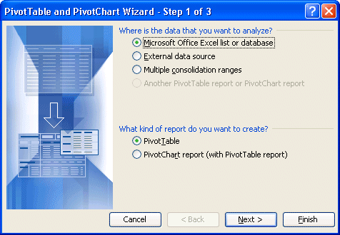
Excel asks you where the data required for creating the pivot table is located. The database can come from four different sources.
| Microsoft Excel lists or database | The data comes from an Excel database, list or of a series of cells located in a worksheet. |
| External data source | The data comes from another software such as Access, dBASE, FileMaker or several others. |
| From a worksheet with labels. | The data comes from a table having already determined. The database is a range of cells already named inside Excel. It uses the contents of the first row to determine the name of the fields for the database. |
| From another pivot table or pivot chart | Allows you to further analyze the data from another existing pivot table. |
Excel will then asks you for the type of report that you want: a pivot table or a pivot chart? This version of Excel allows not only to generate a pivot table but also a pivot chart.
For this exercise, use a Microsoft Office Excel list or database to create a PivotTable.
Press the Next button.
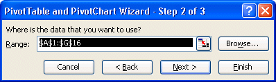
Excel asks you to confirm the place where the data that you need is located for the pivot table.
Make sure that the cells selected are between A1 and G16.
Press the Next button.
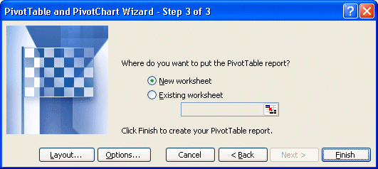
Excel will then ask you where you want to save the pivot table. Is it in a new worksheet or an existing worksheet?
For this exercise, select the New worksheet option.
You could press the End button and to begin to create the pivot table. But before we do that, let's see what other options are offered in this window.
Press the Layout button.
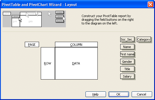
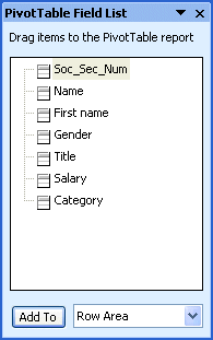
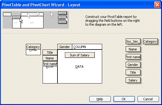
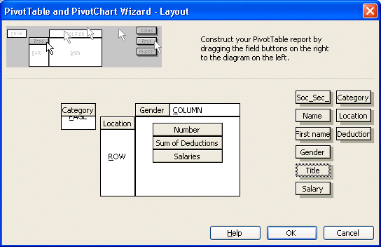
This window also allows you to create immediately a pivot table. You can place the fields that you need, located on the right, into four different areas: page, row, column and data.
| Data | This area shows the results you want to see for a field. By default, the table shows the sum of the values of the selected field if it consists of numbers. If the content of the field is only text, the table will show the number of record that answers the criterion. There are the other functions available such as the average, the standard deviation and several others. A list will be mentioned later on this page. |
| Column | Shows the results of each values of a field in its own column. |
| Line | Shows the results of each values of a field on its own row. |
| Page | Allows to filter the values of the table depending on the values you selected for a field. This allows only to see the records that answer a certain criterion and filters out the rest. |
This presentation of the a pivot table's layout was only to show you the different areas that compose a pivot table. We will not be using this window to create the pivot table. But you could use it when you will be creating you own PivotTables.
For the purpose of the demonstration, press the Cancel button.
Press the Options button.
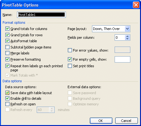
This window allows you to personalize how the data will be viewed in the pivot table. For example, you can decide to activate or not the sums for each row and column of the table. Furthermore, you can change these options at any time according to your needs.
Press the Cancel button.
To create the pivot table, press the Finish button.
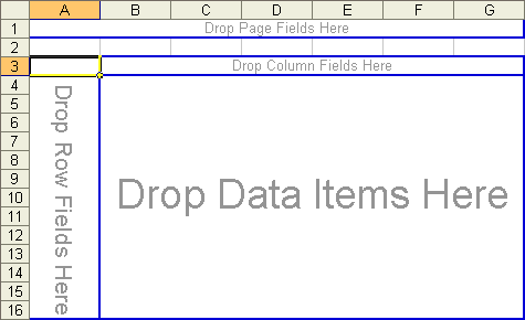
Placing the fields in the tableExcel created a new worksheet with an empty pivot table "shell". The four areas that were before mentioned in the Layout window are all here: page, row, column and data. It's up to you to place the fields that you need in their proper areas and view the results.
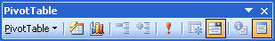
There is also a toolbar for the pivot table that should appear next to it. If you don't see it, here's what you should do to see the toolbar.
From the Edit menu, select the Toolbar option.
From the list of the available toolbars, select the PivotTable option.
It's also possible that you don't see the list of the fields that composes the database. To view it, place the cursor anywhere inside the pivot table shell.
From the Pivot table's field list, select the Salary field.
Press and hold the left mouse button and move the field into the Data area.
Release the mouse button as soon as the square for the Salary field is over the Data area.
OR
From the list of areas at the botton of the window, select the Data area option.
Press the Add to button.
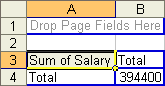
The table now indicates that the sum of all the salaries for the company is 394 400 $. The next step consists in distributing this by occupation within the company.
From the Pivot table's field list, select the Title field.
Press and hold the left mouse button and move the field in the Column area.
Release the mouse button as soon as the square for the Title field is over the Column area.
OR
From the list of areas at the botton of the window, select the Column area option.
Press the Add to button.
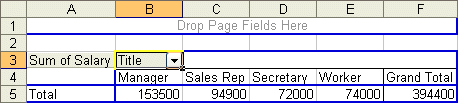
The new table shows the total of salaries by occupation (title: Manager, Worker...) with always a grand total of 394 400 $. The table shows each of the values of the Title field with the total of salaries for each. The next step consists in distributing the total of salaries by title and by gender.
From the Pivot table's field list, select the Gender field.
Press and hold the left mouse button and move the field in the Column area.
Release the mouse button as soon as the square for the Title field column is over the column area.
OR
From the list of areas at the botton of the window, select the Column area option.
Press the Add to button.
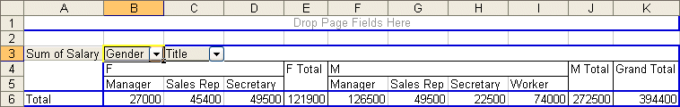
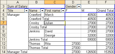
The Gender field will automatically be placed in front of theTitle field. Because of the length the table, only a part is shown on your screen. It's also possible to change the order of the fields in an area. The next step consists in giving the priority to the Gender field over the Title field.
Place the cursor over the Title field in the columns area of the pivot table.
Press and hold the left mouse button and move the Title field to the left of the Gender field.
Once in front of the Gender field, Release the mouse button.
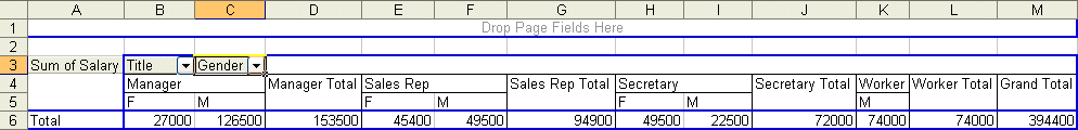
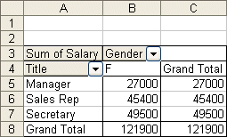
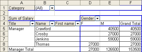
Here is the same data from the previous table but shown in a different way. The salaries totals for the female managers of the company is always 27 000 $ whereas the men have 126 500 $. However, the data is now grouped by occupation and then followed by gender. The next operation will show an easier way to understand the same data.
Place the cursor over the Title field in the columns area of the pivot table.
Press and hold the left mouse button and move the Title field ot the rows area of the of the pivot table (over the Sum of Salary).
Once the field is in the rows area, release the mouse button.
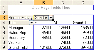
Although it's the same values than the previous tables, this view is much clearer to understand. A pivot table is dynamic. You may place a field in any of the four areas and the table will automatically regenerate with a newer, and hopefully, better view.
View the underlying dataExcel allows you to see the records that compose the results of the table. The next step consists in seeing the records that are the total of the managers (153 500$).
Place the cursor in the cell containing the grand total of the managers (153 500).
Double-click in the cell.
A new worksheet will be created with the records and the data on the managers. You can redo the same thing for every cells of the pivot table.
Return to the worksheet with the PivotTable.
Filter the fieldsThe next operation will allow you to filter the values that you need. It consists in determining the salary total of only the women in the company. The pivot table allows you to mask or to hide the values that you don't need. For this case, it's necessary to hide the men.
Click on the button with a triangle pointing down in the right-hand side of the Gender field. For the example, there are only two possible values: F or M.
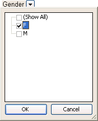
The pivot table shows you a list of all the values that are in the records.
Unselect the box with the M from the list of possible values.
Press the OK button.
This new table shows the salaries total for all the women of the company. notice that the value " M " is not shown in the table.
Reactivate the selection M for the Gender field.
But there is another way of filtering the data. It's by placing the field in the page area.
Place the cursor over the Category field of the area of the columns of the pivot table.
Press and hold the left mouse button and move the Category field in the Page area of the pivot table.
Once the field is in the page area, release the mouse button.
Because the Category field is in the page area, it's now possible to filter all the data of the table on that field. The next exercise consists in showing only the data from the employees that are in category 3.
Click on the button with a triangle pointing down in the right-hand side of the Category field.
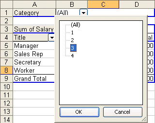
From the list of the possible values, select the value 3.
Press the OK button.
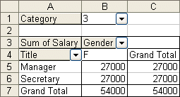
Here is the table of the total of salaries for all the employees that are in category 3. This demonstrates that you may filter the records that compose the pivot table on the fields that compose it; whether it's placed in the row area, the column area or the page area.
Replace the filter for the Category field to All.
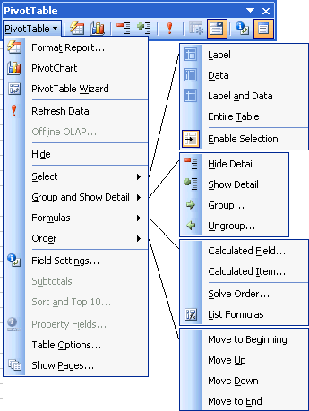
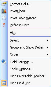
The Pivot toolbar's optionsThe pivot table's toolbar offers other options to change the pivot table's presentation. This next part describes you these options and how they work. You have below a combined picture with all the options from the pivot table.
Format Report option  You created a pivot table with the fields and all the criteria that you need. This option allows you to improve the presentation of your table.
Press the button.
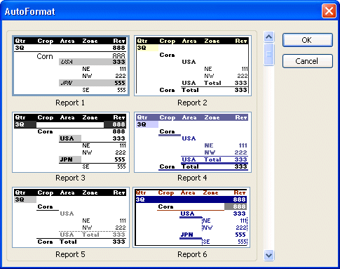
You may change the presentation of the table by selecting one of the predetermined formats. You can change your mind at any time and take another format that better represents the data.
For this exercise, don't change the presentation. Press the Cancel button.
Pivot chart option  There are situations where it's better to represent a mass of data in the form of a chart. As mentioned in some occasions on this site, it's useful to use a chart:
 To simplify the analysis of a mass of data. To simplify the analysis of a mass of data.
To be able to compare the data.
To quickly compare the trends in series of data.
To compare proportions.
Press the button.
This activates the graphic assistant that generates charts. It will pass through the same steps as making a chart with data from your worksheet. Because there is already a Web page that explains charts with Excel on this site, we'll quickly go to the next option.
Press the Finish button.

This chart represents the salaries totals by occupation and the gender from the employees of the company. You can change the presentation of this chart as you would for any other chart. And because it's a dynamic chart, you can change the presentation of the data according to the fields that were chosen.
Return to the worksheet where the PivotTable is located.
Pivot table assistant  This option allows to change the arrangement of fields in the pivot table. This section will demonstrate that you may change the presentation by adding the fields Name and First name to the rows area. This is necessary to be able to demonstrate how the next option works.
Press the button.
Press the Next button.
Press the Layout button.
Move the Name field below the Title field in the rows area.
Move the First name field below the Name field in the rows area.
Press the OK button.
Press the Finish button.
Here is the part of the new table that shows now in the rows area fields Title, Name and First name.
Update the data  This option allows you to update the data of the pivot table after you updated the tables' source database.
Place the cursor in the worksheet with the database.
Place the cursor in the F11 cell (Karl Perry's salary).
Change the salary from 31 500 $ to 37 100 $.
Return to the worksheet with the pivot table.
The change that was made in the database has not been updated in the pivot table. The next action will update your pivot table.
Return to the worksheet where the Pivot table is located.
Press the button.

The partial sum for the workers as well as the total of salaries should have changed to 79 600 $ and 400 000 $ respectively. The pivot table doesn't update unless you press the update button.
Hide  and view and view  details options details options As seen before, you may have in an area several fields to better describe the values. The next two options allows you to view or mask the values of the fields that are to the right of the selected field. If you haven't already done it, add the fields Name and First name to the rows area.


Place the cursor on the Name field.
Press the button.
Although the field First name remains visible, the values are masked.
This option hides the values of the fields that are to the right of the selected field.
Press the button.
The values of the First name field will reappear.
Place the cursor on the First name field.
Press the button.
This option can also help you add fields to an area if none are presently hidden from view. Excel will show you the list of fields that are not in the area. You can select one or many fields to add and press the OK button. But we won't be using that right now. But you now know another way of adding fields to an area.
Press the Cancel button.
For the purpose of the next exercise, hide the contents of the First name field.
Press the First name field located in the rows area.
Press the button.
Add a field to the data areaThis next exercise will demonstrate how to add several fields in the Data area. First, we will adding the same field in the same area. But we'll change some options so that the fields won't be showing the same thing. The first field will show the number of persons in this category and the second will show the sum of the salaries.
From the list of fields, place the Salary field a second time in the data area.
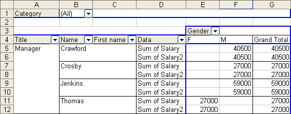
At first, the content of the two fields will be the same. But not for long.
Change the field's parametersIn the previous table, the salaries total appears twice in the Data area. The next part consists in changing the properties, the characteristics, or the parameters in Excel's parlance, of a field to view some other important information and demonstrate the potential of the pivot table.
Click one of the boxes with the text Sum of SALARY.
Press the  button. button.
OR
Press the right mouse button.
Select the Field Settings option.
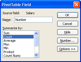
You can change the content of the Name box to better represent the content of the field. You have also many options to represent the data. You can show the sum, the number of records in the category, the average and many more.
Change the name of the field from Sum of SALARY to Number.
Change the synthesis option to Count.
Press the OK button.
This Number field now shows the number of persons in this category instead of the total of the salary. It's possible to change at any time the synthesis option to one from the following list:
| Sum | Show the sum all the values of this field. |
| Nbval | Show the number of records in this category. |
| Average | Show the average of all the values of this category. |
| Max | Show the highest value of the field. |
| Min | Show the smallest value of the field. |
| Product | Show the product of all the values of the field. |
| Count nums | Show the number of records in this category. |
| StdDev | Show the standard deviation of the field. |
| StdDevp | Show the standard deviation of a population. |
| Var | Show the variance of the field. |
| Varp | Show the variance of a population. |
The field parameters window also offers you other options such as demonstrated in the next part.
Click one of the boxes the Sum of SALARY2.
Press the button.
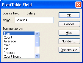
Change the name of the field Sum of SALAIRY2 to Salaries.
Press the field Number button.
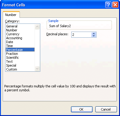
The Number option allows you to change the presentation of the values of the field. It's the same thing as the Number option under the Format, Cell and Number for a cell of your file. But it only affects a field instead of a cell.
From the list of the categories, select the Percentage option.
Press the OK button.
Press the Options field.
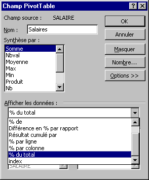
Another powerful element of the parameters of fields is that you may view the values compared to other fields or the total. In this case, we will show the value of field with regard to the total of salaries.
Among the types of views, select % of the total.
Press the OK button.
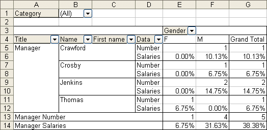
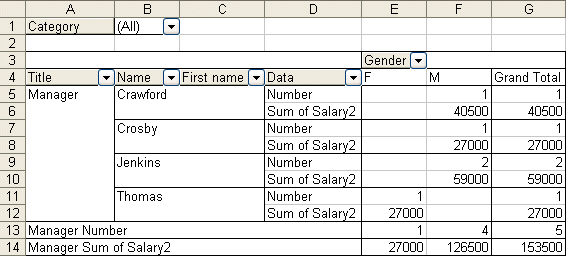
The table's presentation changes again to show the number of persons, by gender, as well as their percentage of salary with regard to the grand total of the salaries.
Group the values of fields Not only can you summarize values by field, you can also group together the values of different fields. For example, you can group together the employees who are in the head office (managers and secretaries) of those that are " on the ground " (sales rep and worker). The next part consists exactly in creating these two groups.
From the rows area, click in the cell where it's written Manager.
While pressing on the CTRL key, click the cell where it's written Secretary.
The CTRL key allows you to select several values to be able to group them together.
Press the right mouse button.
OR
From the PivotTable toolbar, press PivotTable button.
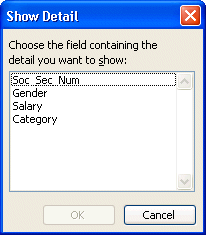
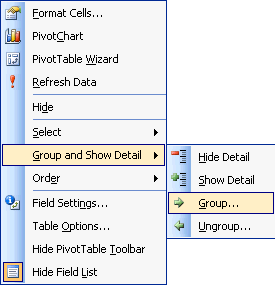
Select the Group and Show Detail option, and Group.
This context menu shows to you some of the options that you saw before. It's easier at times to use the right mouse button then to constantly return to the pivot table's toolbar. It's however necessary to master these options before being able to use them in this menu. There is however an option that's is not anywhere else; that's to group together the values of a field.
From the context menu, select the Group and Show Detail option followed by Group.
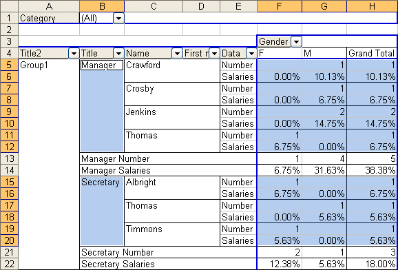
You'll notice that a new field added to the rows area that's called Title2. It only has a single value called Group1. It groups together all the values for managers and secretaries.
It's now time to group together the values worker and salesperson together.
From the rows area, click in the cell where it's written salesperson.
While pressing on the CTRL key, click in the cell where it's written Worker.
Press the right mouse button.
From the context menu. select the Group and Show Detail option, followed by Group.
There are now two groups: group1 and group2. The next part consists in improving the presentation of these groups just a little by changing the names of the field and the values.
Change the name of a valueYou can change the content of a cell in the pivot table like you can do in any ohter cell in the worksheet.
Place the cursor in the cell with the Group1 text.
Click in the Formula box on top of the screen.
Change the name to Office.
OR
Press the F2 key.
Change the name to Office.
Place the cursor in the cell Group2.
Click in the Formula box on top of the screen.
Change the name Field.
OR
Press the F2 key.
Change the name Field.
All that remains is to change the name of the field Title2 to Location.
Place the cursor on the field Title2.
Press the button .
Change the name of the field of Title2 to Location.
The employer at need of a synthesis that does not include fields Title, Name and First name. You could remove the useless fields. But we're simply going to mask them for the moment.
Place the cursor in the cell with the cell Office.
Press the button.
Place the cursor in the cell with the text Field.
Press the button.
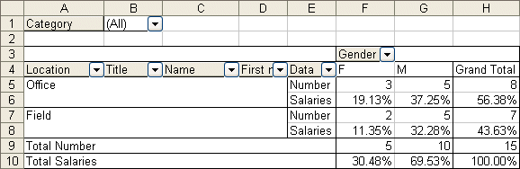
Here is an interesting table with several data represented in various ways. It shows the number of persons who work at the head office or on the field and the proportion of the salary compared to the grand totals. But there's even more.
Creating a calculated fieldThe pivot table allows to add calculated fields. This allows you to do operations on the data in the pivot table. Besides the data supplied in the last table, the employer would like to know in how much his contribution to different programs such as insurance and the pension plan costs the company. This contribution equals to 50 % of the salary of the employees. The next part consists in adding a calculated field that calculates this according to the salary of the employees.
Place the cursor on the pivot table.
From the pivot table toolbar, select the options Formula and Calculationated Field.
OR
Press the right mouse button.
From the list of the options from the context menu, select the options Formula and Calculationated Field.
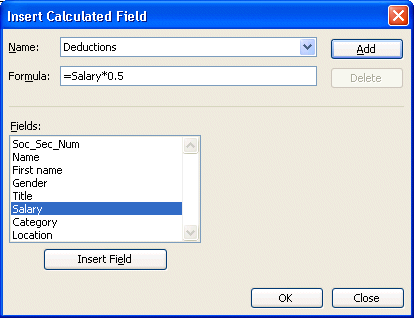
In the box Name, write Deductions.
From the list of fields, click SALARY.
Press the button Insert Field.
Click in the Formula box.
Place the cursor after =Salary.
Add to the formula *0.5.
Press the OK button.
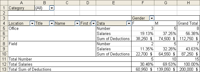
The employer now knows what its contribution is by category and the grand total. For your part, you now know how to add a calculated field in a pivot table.
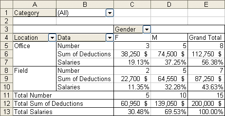
Layout of the fieldsThe last table show the data wanted by the employer. However, you may improve the arrangement of fields. It's time to clean up the report before handing it over. The next part consists in placing the data on the contributions just after the number of persons by group and to remove from the row area the fields Title, Name and First name.
Place the cursor on the table.
From the PivotTable toolbar, select the PivotTable Wizard option.
Press the Layout button.
To remove fields
Place the cursor on the Name field in the Row area.
Remove the field by pressing and holding the left mouse button and move the field outside of the areas of the pivot table.
Release the mouse button when the cursor is out of the table.
Repeat the operation for the First name and Title fields.
To change the order of the fields.
Place the cursor on the calculated field Sum of Deductions in the Data area.
Press and hold the left mouse button and move the field between Number and Salaries.
Release the mouse button when the field box is in the middle.
Press the OK button.
Press the Finish button.
As you are able to understand it after this page, the pivot table offers a multitude of options to represent a mass of data. You can now take advantage of all these options for your own needs. Enjoy! |
No comments:
Post a Comment